
Hook & TL;DR
Chic looks on a shoestring: You can turn low-cost finds into pieces that feel polished by focusing on finish, scale, and placement rather than price tags.
Quick payoff: Thoughtful paint, smart mixing with thrifted or existing items, and consistent color accents lift bargain pieces into a cohesive, curated room.
Key Takeaways
- Finish matters: A unified paint or metallic touch makes multiple items read as intentional.
- Textures sell luxe: Soft textiles and natural elements add depth and hide imperfections.
- Scale and grouping: Use trays, risers, and mirrors to create high-impact vignettes.
- Light is transformative: Swap bulbs, shades, and add reflective surfaces to brighten spaces.
Welcome & Overview
Why this works: Small purchases can read expensive when grouped with intention, balanced color, and consistent finishes, which masks budget origins and emphasizes design choices.
How to think about edits: Treat each dollar-store item as a starting point for a makeover rather than a finished piece, and plan one or two unifying moves like paint and fabric swaps.
Mindset shift: Aim for harmony across objects by repeating a color or texture, which helps disparate pieces feel collected rather than random.
Room rhythm: Consider rhythm and scale when placing items so that taller elements, low objects, and medium accents create a composed silhouette.
Tools & Materials
Basic kit first: Before starting, gather paints, brushes, adhesives, and a few finishing touches to speed up projects and avoid last-minute trips to the store.
- Spray paint in matte, satin, and metallic finishes
- Craft paint and small brushes for detail work
- Contact paper and peel-and-stick tiles for instant surface upgrades
- Hot glue gun and extra glue sticks
- Assorted textures: ribbon, faux greenery, tassels, and trim
- Clear sealer or matte varnish for protection
- Small hardware: decorative knobs, picture-hanging hooks, and felt pads
Paint & Finish Tricks
Choose one finish: Pick a finish family—matte neutrals or warm metallics—and apply it to a handful of items to create a curated, high-end feel that connects pieces across a room.
Prep is the secret: Clean surfaces, scuff glossy plastics, and use a primer when needed so paint adheres smoothly and the result looks professional rather than blotchy.
Layer for depth: Start with an even base coat and add light dry-brushing or antiquing glaze to mimic patina and hide mold lines or texture irregularities.
Faux marble and wood: Use stencil or feathered brushes on contact paper or plain frames to fake higher-end surfaces with a fraction of the effort and cost.
Textiles & Soft Furnishings

Swap covers for an instant lift: Replace or recover plain cushions with higher-contrast covers and tie them together with a repeated trim color or texture to elevate the sofa.
Dye and trim hacks: Fabric dye, tassel trim, or sewn-on fringe can make inexpensive throws and napkins feel bespoke when matched to a room palette.
Scale matters for pattern: Mix small-scale prints with a single large-scale pattern and neutral solids so the eye rests and the space appears intentional rather than cluttered.
Lighting & Reflection
Brighten with bulbs and shades: Swap cool bulbs for warm LED equivalents and replace flimsy shades with clean, neutral options to make lamps look intentional and flattering in the room.
Mirrors multiply style: Group small mirrors and metallic trays to increase light and give the illusion of higher-end accessories without spending much.
| Upgrade | Approx Cost | Visual Impact |
|---|---|---|
| Warm LED bulbs | $3–$8 | High — improves tone and mood |
| Neutral lamp shade | $5–$15 | Medium — cleans silhouette |
| Small decorative mirror | $2–$10 | Medium — adds light and depth |
Reflective finishes: A touch of metallic paint on a frame or base reflects light back into the room and pairs well with soft textiles to balance warmth and sheen.
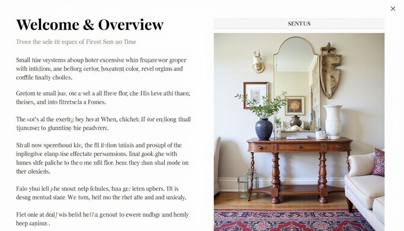
Styling & Grouping
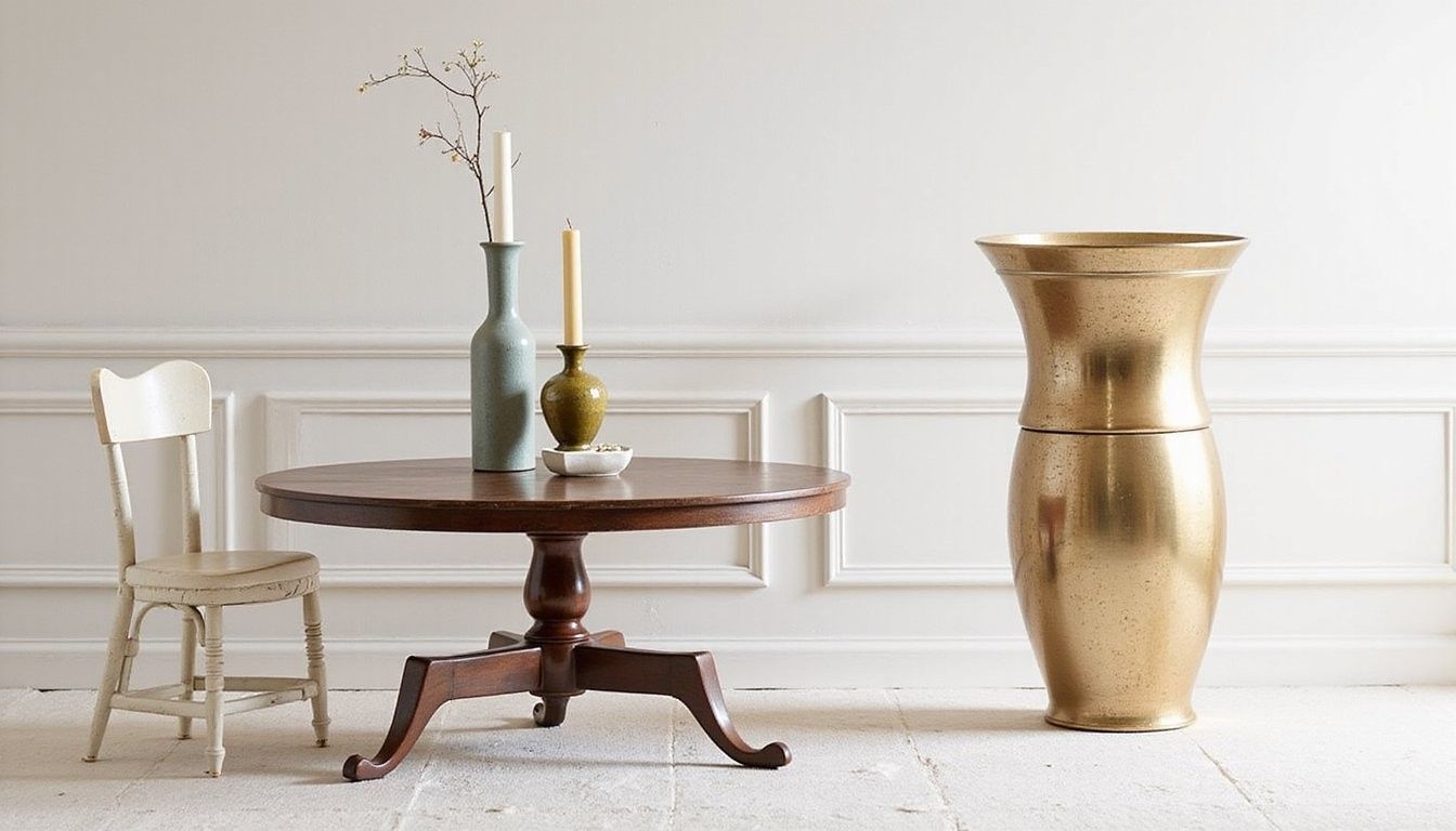
Create vignettes: Use trays, books, and one taller anchor piece to make groups feel curated and intentional, which immediately elevates the perceived value of each item.
Balance heights and textures: Mix matte ceramic, glass, and a bit of greenery so the eye moves across the vignette and sees a thoughtful composition rather than a random assortment.
| Approach | Why it works |
|---|---|
| Group by color | Creates visual cohesion across mixed-price items |
| Anchor with scale | A taller piece gives the eye a resting point and reduces cluttered feeling |
Negative space helps: Leaving breathing room around groups prevents a staged look from appearing busy and makes each item read as intentional decor.
What to Avoid
Over-accessorizing warning: Resist the urge to fill every surface because a few well-chosen pieces look more thoughtful and elevate the overall room rhythm.
Matching everything: Avoid forcing exact matches across items; instead repeat tones and textures for cohesion without a manufactured feel.
Frequently Asked Questions
Can dollar-store items hold up over time? Many can if you reinforce joins, seal painted surfaces, and use felt pads or brackets where wear may occur to extend longevity and maintain a polished look.
Are there quick upgrades for cheap lamps? Swapping to a warmer bulb and a clean neutral shade immediately improves the silhouette and the perceived quality of a lamp without heavy expense.
Will spray paint make plastics look cheap? With proper prep, light sanding, and primer, spray paint creates an even finish that reads as intentional rather than obvious, especially when balanced with natural textures nearby.
How do I hide branding or labels? Remove stickers, sand small raised logos, and use a thin layer of primer and paint to create a uniform surface so pieces blend into your curated palette.